Background
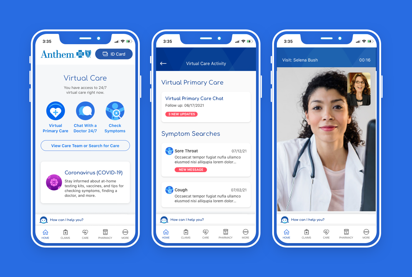
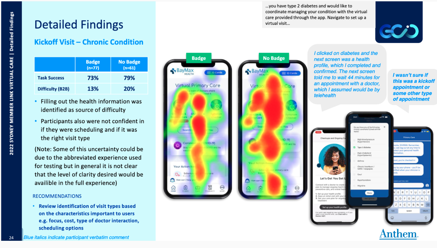
The Virtual Care experience in Anthem’s Sydney Health mobile app was proving to be confusing, in that members are required to select the type of care they need, and the “primary” and “urgent” terminology used was suspected to not completely fit with users’ mental models for what those terms actually mean. It was also not clear whether the initial layout was the most beneficial, so multiple layout options were tested.
Objective
To understand how the entry points could be adapted to improve user engagement toward the proper flow based on their need, and decrease the use of “primary care” for “urgent care” issues.
Responsibility
Lead UX/UI Designer, working with the Product Manager and Project Manager, a User Researcher on our team, as well as a small team of Developers to deliver the end-to-end final product.
Methodology
We utilized the Double Diamond approach to conduct market research, user journeys via Miro in order to collaborate with team members. Iterative usability testing and surveys were used after creating user profiles to guide our decisions. Design and content approaches were examined to identify improvements to overall navigation, layout, and UI elements throughout the various stages and types of care.
Anthem
Sydney Health Mobile App
User Research Demographics


Creative Phase
Once we began the Develop portion of the Creative Phase, we created user flows, user profiles, basic wireframes, and initial design while collaborating with stakeholders and discovering a few technical setbacks that affected our initial design ideas. This also helped us to prioritize critical elements that we could include as well as “later phase” elements, avoiding the need to address these technical setbacks later in the process.
Initial Sydney Health Home Screen Design Ideas
The percentage of patients in the “Primary Care” pathway was designated as too low, indicating misdirection at the entry points. Also, more patients than desired were using “Virtual Primary Care” instead of “Symptom Checker” or “Chat with a Doctor” for “urgent care” concerns.
Delivery Phase
After our testing was complete, we moved onto the Delivery Phase and finalized the design with stakeholders and development was able to begin.